30.9.10
conventions of the action genre
Due to the fact that our film will be a buddy-cop, action film, we decided to do a couple of posts detailing the basic conventions based around a these genres. from our initial research we have found that one typical convention of the action genre is the heroic main character who is usually male and in a lot of films starts off in a lower status and does not want to be a hero. this is seen in films such as Hancock and Die Hard. the 1980's are well known as an era for action films and the birth of the buddy-cop action movie. with films such as 48 Hours and Lethal Weapon we can see that another typical convention of this genre is to have a very typical, low budget plot line with a pair of "cops" with martial arts or sharp shooting skills facing unbeatable odds and eventually capturing the main antagonist(s) at the end of the film. another convention of the action genre, particularly used around the later 1980's is the mixing of two genres such as sci-fi and action with films such as Terminator and Robo-Cop, horror and action such as Alien or Predator and even comedy and action such as Dragons Forever and Beverly Hills Cop.
27.9.10
Group magazine cover de-construction - Iron Man
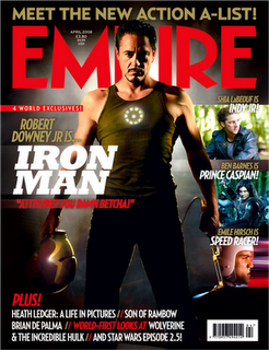 Our group magazine deconstruction is from the magazine 'Empire' which is a very famous magazine. It is seen officially as the most successful magazine in Britain above Total Film and we as a group felt that we had to take inspiration from a magazine that is so popular with British films. Also the fact that the front cover broadcasts action film genre, which is our chosen genre for our trailer, makes it obvious to us to want to use it as a basis and inspiration for what we want to do in our film magazine cover. The main feature of the magazine cover which jumps out is the picture of the main protagonist Robert Downey Jr as the 'Iron Man'. The use of costume attracts the audience as it is shows off his strong physique. This is typical of a main protagonist in an action film as he is strong and fierce. Also his stance of clenching his fists and frowning shows power and this is a big feature of a magazine cover. The character also appears to have a head in his hand and a bright device on his body. This is very common of action films as the audience will want to know what the thing is on his body and what and why he is holding something in his hand. The fact that the name next to the picture (Robert Downey Jr) is so famous, this makes the audience think that it is going to be a really good film as it can attract a top film star. There is also a small phrase next to the picture which says: "Attitude? You damn betcha!." This is effective as a lot of main characters in all films have an iconic catchphrase which represents their character personalities; with this one showing his dominance and attitude. The use of colour is also a strong part of this magazine cover. The use of red in the main magazine title represents danger and suspense, which is what an action film genre is strong at producing if successfully made. The fact that most of the other colours used in the rest of the cover are lighter or more faded than the title makes it stand out more; and therefore the audience are drawn to this along with the title. Both of these things are what the producers want. The use of a grey faded background is effective for this cover because it gives off the idea of somebody walking through it. This leaves the audience on the edge of their seats and they are wondering what is through the murky mist. The only other colour used apart from those already mentioned is white. This is an effective colour as it is the perfect colour to mix in with red and grey. It is very bright and stands out over the text which is in smaller print. The use of the sub-title also escalates the magazine and makes the audience want to read more into the magazine. 'Meet the new action A-list!' is very cleverly included as the audience will not know who the 'a-list' are. They will then want to know and buy the magazine. The use of the exclamation mark also gives off the tone of excitement and shock which is what they want their audience to feel when reading this statement. To the right-hand side of this magazine cover, there is the use of images from other films with famous actors which the audience will recognise. This improves the magazine as there is more for them to find out about, rather than just the film used as the main attraction in the centre of the magazine. For example, the top picture shows Shia LeBeouf, who is one of the most successful actors of recent times. The audience will want to know about his film as well, as it is similar in many ways to Iron Man. Also the use of additional features which show what else in the magazine, shows the depth and quality of the magazine. The fact they have squeezed in the information at the bottom shows how much the magazine has to offer to its audience, and it also is of very high quality and the audience will know and want to read about them as well. Overall, they get a lot of quality for money when reading, which is what we want to do for our magazine cover. This has proved to the group through careful and concise research why this is one of the most successful magazines out there. The features of this magazine are very strong and we will aim to use these, challenge them and develop them as best as we can. We know that if we can get it near to the standard of this magazine, we will have produced a top-notch magazine cover.
26.9.10
Group Poster De-construction - Starsky and Hutch
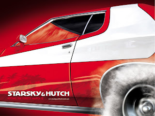
this is a picture of one of the promotional posters for the 2004 Starsky and Hutch film. As this film was a big influence on our group we decided it would be a good idea to use it for our group de-constructions. the poster is a picture of a car which, from prior knowledge, we can tell is the iconic red Gran Torrino from the 1980's TV series' of Starsky and Hutch which the film is based on. we can tell that it is this car from the iconic white decal on the side of the car. the white of this decal is mirrored in the title.
the wheel of the car is spinning, this can be seen by the smoke around the tire. this is probably an effect put on the picture in editing but it has been used to show the fast pace of the film itself and makes the audience want to see the film.
in the reflection of the car we can clearly see palm trees. this sets the scene as their is no background to the picture. this has probably been done to draw focus solely to the car as this is the main focal point of the poster. this is also mirrored in the cars wing mirror which upon closer inspection seems to be added in.
below the text their is some writing in a different shade of red, this text is a mixture of the cap line of the film and the release date. this is a good use of space and a clever effect as it makes the audience think and therefor remember it.
the overall effect of the poster is sharp and bold. the reds are deep and the car is shiny. this shows it as being a mainstream film and not an amateur piece.
we will have to experiment with effects when creating our poster, this will make it seem bolder and stand out.
24.9.10
Magazine cover de-construction - Total Film magazine
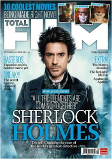 this is a picture of the September 2005 issue of Total Film magazine's cover. i chose this particular magazine cover as the main story seemed to be similar to our idea; an action comedy, set in an older time with police and crime prevention as a plot line. This magazine cover has a large picture of a film coming out at that time. like most magazines they have used this image as both a back and foreground by obscuring part of the magazine title with the head of an actor. we will incorporate this feature into our magazine. another useful and common feature of film magazines is to include articles about films which have not been brought out yet. although we will not be able to create actual articles we can create captions as if our magazine had the articles within it. we can also include pictures of the actors within these films and quotes from the actors. these are both also common features of film magazines although have not been used in this particular one. the title of the film that they have used as the main picture has been written in a suitable font and has been coloured to both stand out and tone in with the picture. this is another feature of film magazines and shall be used in the construction of our film magazine cover. their are also articles listed on the cover as small headings posted arround the body of the large actors picture. their titles have also been toned in with the background. another feature of this magazine cover is the pictures at the top giving a clue as to what one of the other articles is about and what films may come out in the near future. this shall also be featured in our magazine cover. we can find news on upcoming movies from sutch sites as IMDb and comingsoon.net i have also noticed that most film magazines have a bar-code in either the top of bottom right hand corner. for our group this will be decided upon wich one suits our oicture and text format better.
22.9.10
Poster de-construction - Gremlins
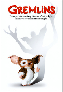
Gremlins is an action sci-fi comedy film made in 1984. it is about a boy who gets a pet for Christmas but he has to follow some rules. he fails to follow these rules and bad things start to happen as the pet creates a set of evil gremlins. i chose this poster for my de-construction because i felt that, although it was a professional film poster its style and quality would be achievable b us with a very menial budget.
for example the white background with a Shadow peeling across it would be very simple to create with the schools editing software as would the light spot on the wall partially blocking the Shadow however this is a link to the film itself and so may not be necessary on our poster. also the use of distortion in this poster as the shadow of the gremlin does not fit the physical object in the shot is another feature we may look into using in our poster.
the title on the poster also shows features of a 1980's film poster as it is bold and stands out from the text instead of fitting in with the background like films of today such as Shrek or Casino Royale. also, it has a font which fits in with the themes within the film such as childishness and disorder.
the tag line under the title is also a feature we shall include in our poster. it easily sums up the film and gives the reader an idea of what the film is about, enticing the audience and making them want to watch the story.
21.9.10
Film trailer de-construction - The Descent
The trailer opens with the caution message on a green background. this is customary for trailers shown in cinemas as this tells the audience that the trailer is going to be age restricted with scenes of violence and gore or sexuality. this provides the producers of the film with liability for anyone under the verified age who see's this. the shot then quickly changes to the producers logo with an eerie effect on the background, this typically shows that this will be related to the film and helps set the mood for the audience, they will now be in anticipation of what may happen in the film. this then fades to a short extract of the film, one of the main characters is taking a group photo of the other people who are with her in the wooden camp behind them. this shows the setting of the film and also helps the audience get a clear picture of the characters relationships with each other, it becomes clear that they are on an expedition of some sort. the audience can tell that the woman is a main character as she has the opening line, she is alone in the shot, she is in control within the scene and she is filmed in a clear mid-shot focusing on her face and showing her authoritative status. as she takes the picture the image goes to a still shot of the others in black and white. this could symbolise a memory or the scene as being in a flashback the image fades to darkness and the audience see an Arial shot of a highway cutting through a Forrest. this quickly changes to a scene with people in a car talking so the overhead shot was to establish the scene two women are in the car talking and laughing, they are obviously friends. the camera then cuts to one of the women throwing a rope down from where she is standing at the top of a rock face. the camera then follows the rope down to the inside of a pot hole cave with the rest of the team from the photograph. we see a close up from a high angle of one of the explorers standing under a drip from above, she gets called to by another woman and the camera changes to an extreme close up of her applying her safety harnesses the camera then cuts to darkness and is re lit by the head torch of one of the explorers as they clamber through the darkness deeper into the hole. this is done for a few minutes with different shots such as panning and close ups etc. this shows a lapse of time and gives the impression that they are going further and further down. these shots are broken up with words such as 'claustrophobia', 'disorientation', 'hallucination' and 'fear' written in small, hazy font, mimicking the atmosphere of the dark, cramped setting. towards the end of these the audience can see shots of the characters clambering into a bulge in the tunnel. this is followed by a mid shot with a green filter as if being shot through a night vision camera. the audience can see a woman talking to another woman, as she looks at this woman the camera zooms round to view her. when the camera zooms back the audience sees the first woman standing with a shadowy figure behind her, the shot does not freeze for long enough for the audience to focus on him but just long enough for them to see that this is not right. this is followed by shots of people running, the camera is in a handheld position so the audience can only see a flurry of blurry images this is then slowed down by a short shot of a head torch glowing dimmer and dimmer as the power drains out of it. the camera then changes to a shot of one of the explorers stuck on a rock. she is panicked. after a few more shots of caves and tunnels being lit by overhead torches one of the explorers ignites a flare. the camera then increases in brightness, this then quickly changes to a new shot (this effect is like the one at the beginning where the flash of the camera was used to change to the next scene) the next shot sequence shows the group all crowding round the flare watching the walls, these shots have quotes flickering at the side of the screen from different critics who have seen the film and have given good reviews. these shots show what happens after the first attack when the torch went out. the title then appears in the same misty font as the key words before but in a much larger font. the titles fade away to three clips of some of the explorers fighting the beasts. this then changes again to the end notifications and the coming soon end title which is another convention of the modern movie trailer.
20.9.10
De-Constructions brief
as part of our groups research we were advised to de-construct a film trailer from the same genre as ours, a poster from the same genre as ours and a film magazine cover with the main article being from the same genre as ours if possible. we were to do one set of these each and then one set as a group.
15.9.10
The Brief
To create a promotional package for a film. this should consist of;
- a two minuete long teaser trailer of our film
- a poster for our film
- a Film magazine cover advertising our film as the main feature article
we were directed by the teacher to form into groups of about four. our group consists of; Robin Hutchinson, Harry Booth, Jack Jenkins and myself. we then set about the task of creating a time plan to assist us in our project with regards to time mannagment and co-operation.
after this we started to discuss genres we might choose. after much consideration we had three genres to choose from; Horror, Sci-Fi and Action. we decided to go for Horror as we thought that Sci-Fi may be too difficult on our small budget and an action film would be to dull against all of the action films of today.
Time plan
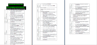
this is a copy of our time plan. we have structured it on a weekly basis giving us an achievable ammount of work to do each week. Some of the tasks we have allocated to certain members of the group who were either very interested in this particular task or who we as a group thought could achieve the task most efficiently.
Although we plan to stick to our time plan if things do not all go according to plan we may make some changes to the plan.
Subscribe to:
Comments (Atom)