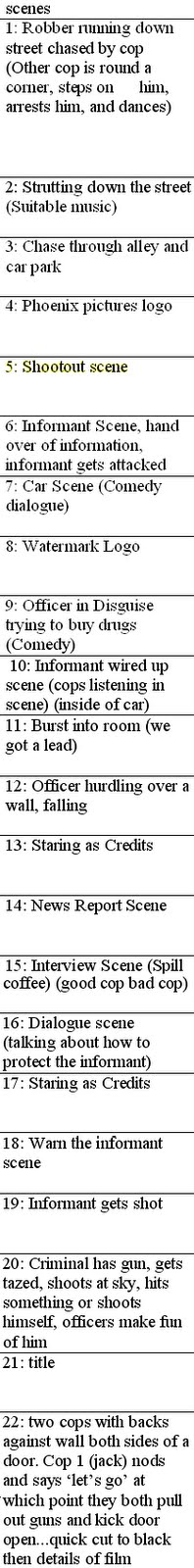
after running through the list of scenes we decided to make a storyboard. we have tweaked this after filming by deleting scenes we did not do and adding in screenshots from our filming to create a more professional look.


 we will use the interior of robins car as a police car.
  this is another shot of the inside of robin's car. this is to show how some difficulties that may arise when filming might be the shape and ergonomics within the car as they are not inkeeping with the films tone.
  this is a row of garrages that we may use for one of our scenes as it is very plain and the style is quite inkeeping with the tone of our piece appart from the plastic drainpipes.
  this is a shot of the fenced off land around the train tracks in whittlesey this is a good location as the wherehouses around it are quite inkeeping with the overall tone and theme of our film.
  this picture is of a wooden gate leading out into one of the alleys that we may use to film due to the darkness and simplicity of the wall structures wich will help with our chosen style. the door opens onto private property so when filming down the public alley we will need to ensure nothing is dammaged.
  this is a photo of the same alley from a different angle. in this shot it is easy to see that the alley is a good place for us to film as it is long and so we can film in two different places and it will seem like two differewnt alley ways. also the surroundings are quite simplistic and basic. the scrached paintwork on the side of the right building also ties in well with our themes of an older and more grimey time and place.
  this is a shot of the garrages allong one side of a quiet cul-de-sac. this will help us with filming as along with the fact that the colours and shapes of the buildings tie in with our themes the quietness of the area means we are un-likely to be disturbed whilst filming.
  this is another shot of the same alley as in two pictures above. this shot easily shows how, although it is the same alley, it seems like two different places. also the curve of the alley will hide Any un-wanted traffic that may contrast with our style or set era.
  this is a shot of the entrance of another alley. this also shows a picture of the back half of a car that we may use as it ties in well with the time period of our film.
  this is a shot of the other end of the same alley as above. the elements in this shot all tie in well with our film as being set in the 80's ( the wood telephone pole and the square metal bin) and the setting of england with the common street name 'old crown lane'


I had already researched a little into mike Leigh but, as we were going to be using his ideas on directing and characters, i thought it would be better to have more focused research on him. for this i decided to use Wikipedia, IMDb and google to find out as much about his directing style as i could. I also suggested to the rest of my group that they do more research into his methods so they would have a clear understanding of his methods and what i was going to ask of them. I then watched some of his films in which he uses the actors improvisation instead of a script, such as life is sweet.
Whilst researching Mike Leigh i discovered; Most of his work in theatre and film is done without any initial script. He and the actors improvise their characters and the scenes under his overall control. This is what i intend to do with our piece as i think it will give the characters a more realistic look.
He became an Associate Member of RADA (Royal Academy of Dramatic Art) as have many famous actors and directors such as Sir Derek Jacobi and Sir Anthony Hopkins. He Graduated from RADA and moved on to the Camberwell School of Art and the Central School of Art and Design. He began as a theatre director and playwright in the mid 1960s. in the 70's and 80's he began to work on film and developed his "kitchen sink realism" style.
He was made a Fellow of the British Film Institute in recognition of his outstanding contribution to film and television culture. He was awarded an OBE (Officer of the Order of the British Empire) in the 1993 Queen's Honours List for his services to the film industry. This shows that he is a well known director and has been awarded for his films.
Using a well known, praised directors style to create my own will help as i will be able to see if it works and if not then i will use a different method. this will become clear after our first session of filming, however i think that this will work as having looked closely at his films and seen interviews in which he tells the audience of his style, I now have a better understanding of his work.
 works but i was interested in knowing his methods and whether or not he used a certain type of signature shot like some directors do. Guillermo del Toro Gómez was born in 1964 in Mexico. he has worked to create brilliant films in both modern film and Mexican cinema. he was the director for such films as hell boy and pans labyrinth. he has always been into insects, clockwork and monsters and he uses these features in many of his films. although he does not have a signature camera shot, both darkness and clockwork are themes in a lot of his films and this could be seen as a signature of his films. the next director i looked at was mike Leigh. He was born in 1943 in England. directed such films as Life is sweet and Topsy Turvey. most of his films are set in England an have a very realistic
  approach in terms of set and characters with elaborate individuals amongst the normal people. he is also very well known for using improvisation to create characters and story lines in his plays instead of using a strict script. he sets up ideas of what he thinks might happen, gives the actors a starting point and then lets them determine their own 'fate' Intimate moments are explored that will not even be referred to in the final film to build insight and understanding of history, character and inner motivation. this gives the actors performances a more realistic and simplistic edge. this improvised planning approach is his signature and i will think about doing a similar concept with our group although i will probably have to modify this technique slightly due to time and the fact that we are not creating a whole film but just extracting parts of an imaginary film into a collective collage of clips. the third and final director i looked at was Neil Armfield. he was born in 1955 in Australia. I
  particularly focused on his film Candy (2006) which is set in Australia but like mike Leigh's work takes on a fairly simplistic approach and does not contain many special effects. Armfield uses a house style for Candy by his use of unusual angles for the scenes in which the main characters use drugs to show how the drugs are effecting the minds and eye-sight of the characters. he is also well known for using a dutch angle in scenes in which one or more characters perspective is twisted. i also looked at the work of Matthew graham, tony Jordan and Ashley Pharaoh. the creators of life on mars and ashes to ashes, two TV dramas which were based in the same time period as our piece and focused on the same idea as our project did. i watched some you tube clips of ashes to ashes and i was able to acquire a copy of the life on mars box set so i was able to watch closely and pick out key elements of the programme which aided in the appearance of the time difference and setting. i was able to depict three main points;
 Our group magazine deconstruction is from the magazine 'Empire' which is a very famous magazine. It is seen officially as the most successful magazine in Britain above Total Film and we as a group felt that we had to take inspiration from a magazine that is so popular with British films. Also the fact that the front cover broadcasts action film genre, which is our chosen genre for our trailer, makes it obvious to us to want to use it as a basis and inspiration for what we want to do in our film magazine cover. The main feature of the magazine cover which jumps out is the picture of the main protagonist Robert Downey Jr as the 'Iron Man'. The use of costume attracts the audience as it is shows off his strong physique. This is typical of a main protagonist in an action film as he is strong and fierce. Also his stance of clenching his fists and frowning shows power and this is a big feature of a magazine cover. The character also appears to have a head in his hand and a bright device on his body. This is very common of action films as the audience will want to know what the thing is on his body and what and why he is holding something in his hand. The fact that the name next to the picture (Robert Downey Jr) is so famous, this makes the audience think that it is going to be a really good film as it can attract a top film star. There is also a small phrase next to the picture which says: "Attitude? You damn betcha!." This is effective as a lot of main characters in all films have an iconic catchphrase which represents their character personalities; with this one showing his dominance and attitude. The use of colour is also a strong part of this magazine cover. The use of red in the main magazine title represents danger and suspense, which is what an action film genre is strong at producing if successfully made. The fact that most of the other colours used in the rest of the cover are lighter or more faded than the title makes it stand out more; and therefore the audience are drawn to this along with the title. Both of these things are what the producers want. The use of a grey faded background is effective for this cover because it gives off the idea of somebody walking through it. This leaves the audience on the edge of their seats and they are wondering what is through the murky mist. The only other colour used apart from those already mentioned is white. This is an effective colour as it is the perfect colour to mix in with red and grey. It is very bright and stands out over the text which is in smaller print. The use of the sub-title also escalates the magazine and makes the audience want to read more into the magazine. 'Meet the new action A-list!' is very cleverly included as the audience will not know who the 'a-list' are. They will then want to know and buy the magazine. The use of the exclamation mark also gives off the tone of excitement and shock which is what they want their audience to feel when reading this statement. To the right-hand side of this magazine cover, there is the use of images from other films with famous actors which the audience will recognise. This improves the magazine as there is more for them to find out about, rather than just the film used as the main attraction in the centre of the magazine. For example, the top picture shows Shia LeBeouf, who is one of the most successful actors of recent times. The audience will want to know about his film as well, as it is similar in many ways to Iron Man. Also the use of additional features which show what else in the magazine, shows the depth and quality of the magazine. The fact they have squeezed in the information at the bottom shows how much the magazine has to offer to its audience, and it also is of very high quality and the audience will know and want to read about them as well. Overall, they get a lot of quality for money when reading, which is what we want to do for our magazine cover. This has proved to the group through careful and concise research why this is one of the most successful magazines out there. The features of this magazine are very strong and we will aim to use these, challenge them and develop them as best as we can. We know that if we can get it near to the standard of this magazine, we will have produced a top-notch magazine cover.

 this is a picture of the September 2005 issue of Total Film magazine's cover. i chose this particular magazine cover as the main story seemed to be similar to our idea; an action comedy, set in an older time with police and crime prevention as a plot line. This magazine cover has a large picture of a film coming out at that time. like most magazines they have used this image as both a back and foreground by obscuring part of the magazine title with the head of an actor. we will incorporate this feature into our magazine. another useful and common feature of film magazines is to include articles about films which have not been brought out yet. although we will not be able to create actual articles we can create captions as if our magazine had the articles within it. we can also include pictures of the actors within these films and quotes from the actors. these are both also common features of film magazines although have not been used in this particular one. the title of the film that they have used as the main picture has been written in a suitable font and has been coloured to both stand out and tone in with the picture. this is another feature of film magazines and shall be used in the construction of our film magazine cover. their are also articles listed on the cover as small headings posted arround the body of the large actors picture. their titles have also been toned in with the background. another feature of this magazine cover is the pictures at the top giving a clue as to what one of the other articles is about and what films may come out in the near future. this shall also be featured in our magazine cover. we can find news on upcoming movies from sutch sites as IMDb and comingsoon.net i have also noticed that most film magazines have a bar-code in either the top of bottom right hand corner. for our group this will be decided upon wich one suits our oicture and text format better.

we were directed by the teacher to form into groups of about four. our group consists of; Robin Hutchinson, Harry Booth, Jack Jenkins and myself. we then set about the task of creating a time plan to assist us in our project with regards to time mannagment and co-operation.
after this we started to discuss genres we might choose. after much consideration we had three genres to choose from; Horror, Sci-Fi and Action. we decided to go for Horror as we thought that Sci-Fi may be too difficult on our small budget and an action film would be to dull against all of the action films of today.
